
Email marketing keeps getting better. It’s key to think about inclusive design more. Now, making sure emails work for everyone is very important.
When we design emails, thinking about dark mode and accessibility helps a lot. It makes emails better for everyone. This way, businesses can make emails that are fun and easy to use.
Table of Contents
The Evolution of Email Design

Email design has changed a lot over time. It went from simple text to colorful, interactive content. This change came from new tech and what people like more.
From Plain Text to Rich Media
At first, emails were just plain text. But as tech got better, emails could show pictures and links. This made emails more fun and useful for marketing.
Now, emails can have videos and animations too. This makes them even more fun and interesting for people to read.
The Mobile Revolution in Email
Mobile phones changed how we use emails a lot. Now, emails need to look good on phones and tablets too. This means emails have to be easy to read on any screen.
Understanding Dark Mode in Email

Dark mode is more than a design trend. It’s key for email use, making it comfy and engaging. As more people use dark mode, email designers must get it.
What Is Dark Mode and Why It Matters
Dark mode uses light text on a dark background. It’s not just pretty; it’s practical. It makes screens less bright, which is good for your eyes, mainly in dim places.
The Science Behind Dark Mode Benefits
Science shows dark mode is good. It cuts down eye strain and saves battery.
Reduced Eye Strain and Blue Light
Too much screen time can hurt your eyes. Dark mode helps by cutting down blue light. This is great in dim places.
Battery Conservation on OLED Screens
Dark mode saves battery on OLED screens. These screens only light up what’s needed. So, a darker screen uses less power. This is big for phones.
In short, knowing about dark mode is key for good email design. It makes emails look nice and feel comfy. By using dark mode, email makers improve the user experience.
The Rising Popularity of Dark Mode

Dark mode is now a big part of user experience design. More and more people like it because it’s good for their eyes. It’s getting popular on many devices and platforms.
User Adoption Statistics
More and more people are using dark mode. They like how it looks and how it makes their eyes feel better.
About 70% of users now use dark mode on their devices. This shows how popular it’s becoming.
Platform Implementation Across Devices
Big operating systems have added dark mode. This makes users want it even more. It’s becoming a big deal.
iOS and macOS Dark Mode
Apple made dark mode for iOS and macOS. Many apps now have it too. Users really like it.
Android and Windows Dark Mode
Android and Windows also have dark mode. This makes things easier for users. They can use it on many devices.
| Platform | Dark Mode Support | User Adoption Rate |
|---|---|---|
| iOS | Yes | 75% |
| Android | Yes | 65% |
| Windows | Yes | 70% |
| macOS | Yes | 80% |
Email Accessibility Fundamentals

Email is a key tool for talking to each other. It’s important that everyone can use it, including those with disabilities. This makes sure emails are for everyone and follow the law.
WCAG Guidelines for Email
The Web Content Accessibility Guidelines (WCAG) help make emails better for everyone. They suggest:
- Using clear and simple language
- Providing alternative text for images
- Ensuring sufficient color contrast between text and background
- Making sure that the content is navigable using assistive technologies
By following these tips, emails can be more accessible to all.
Legal Implications of Inaccessible Emails
In the US, emails must be accessible to people with disabilities. This is because of the Americans with Disabilities Act (ADA).
ADA Compliance Requirements
The ADA says businesses must make digital content, like emails, accessible. This means using email templates that everyone can use and making sure emails work with screen readers.
International Accessibility Laws
Other countries also have laws about making digital stuff, like emails, accessible. For example, the European Union’s Accessibility Act has rules for digital products and services, including emails.
It’s important for businesses to know and follow these laws. This helps avoid legal problems and makes emails better for everyone.
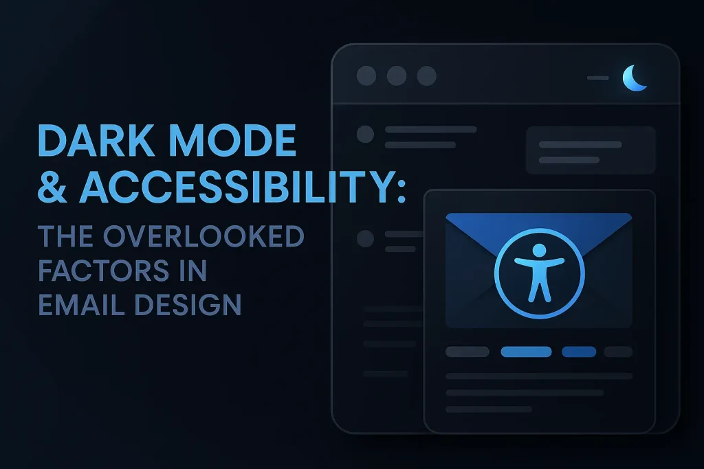
Dark Mode & Accessibility: The Overlooked Factors in Email Design

In email design, dark mode and accessibility are key but often ignored. As we use digital tools more, it’s vital to see how these elements affect our emails.
The Intersection of Dark Mode and Accessibility
Dark mode and accessibility go hand in hand in email design. Dark mode uses a dark background with light text. It’s not just pretty; it’s also good for your eyes in dim light. Accessibility means making emails easy for everyone, including those with disabilities.
Dark mode can make emails better for everyone. A dark background can ease eye strain in dim light. But, if done wrong, it can cause color issues that make text hard to read.
Why These Factors Are Often Neglected
Dark mode and accessibility are often ignored in email design. One reason is the complexity of implementation. Making emails look good and accessible in both modes takes extra work.
Another reason is a lack of knowledge. Many designers and marketers don’t know how their choices affect users, like those with disabilities.
| Design Consideration | Light Mode | Dark Mode |
|---|---|---|
| Background Color | White or Light Gray | Dark Gray or Black |
| Text Color | Black or Dark Gray | White or Light Gray |
| Color Contrast | High contrast recommended | High contrast recommended |
Technical Challenges of Dark Mode Email Design

Designing emails for dark mode is hard. Users like dark mode on many devices. So, emails must look good in this setting.
Rendering Inconsistencies Across Email Clients
Each email client shows dark mode differently. This can mess up how emails look. It might make brands look bad or text hard to read.
“The lack of standardization in dark mode rendering across email clients complicates the design process.” Designers must test emails on many platforms. This ensures a good user experience.
CSS Support Limitations
CSS works differently on each email client, and dark mode makes it worse. Some CSS features don’t work or act weird in dark mode. This limits what designers can do with email looks.
Gmail’s Approach to Dark Mode
Gmail has its own dark mode rules. It changes text and background colors but keeps background images the same. Designers must know this to make emails work right.
Outlook’s Dark Mode Rendering
Outlook has its own dark mode issues. Outlook.com changes colors, but Microsoft Outlook on desktop doesn’t. Knowing these differences helps make emails look good everywhere.
Color Considerations for Dark Mode Emails

Dark mode email design needs careful color choices for good looks and easy reading. As more people use dark mode on devices and apps, email makers must think about how their emails will look. They need to make sure their designs are clear and pretty in this new way of seeing things.
Color Contrast Requirements
Color contrast is key in dark mode email design. The Web Content Accessibility Guidelines (WCAG) say text should have a contrast ratio of 4.5:1 and large text 3:1. It’s very important to make sure your email meets these standards so people can read it easily.
- Use high contrast colors for text and background.
- Avoid using colors that are too similar in hue and saturation.
Creating Color Palettes That Work in Both Modes
Creating a color palette for both light and dark modes is a big task. Choosing colors that work well in both modes is very important. A good idea is to pick colors that can be used in different ways and look good in both modes.
Avoiding Automatic Inversions
Some email clients change colors to dark mode automatically, which can mess up the look. To avoid this, designers can use CSS media queries to pick dark mode colors. For example, you can set dark mode colors with the @media (prefers-color-scheme: dark) query.
Typography Best Practices for Accessibility

Accessible typography in emails is more than looks. It’s about making sure everyone can read it. This means picking the right fonts, sizes, and spacing.
Font Selection for Readability
The font you choose is key to email readability. Fonts like Arial, Helvetica, and Open Sans are good because they’re clear and simple. Stay away from fancy fonts that are hard to read, like those with lots of curves.
Key considerations for font selection include:
- Legibility: The font should be easy to read, even at smaller sizes.
- Consistency: Using a consistent font throughout the email enhances readability.
Text Sizing and Spacing Guidelines
Text size and spacing are important for email accessibility. They help ensure everyone can read your content. This includes rules for mobile devices and how close letters should be.
Minimum Font Sizes for Mobile
For mobile, use a font size of at least 14px. This helps those with vision problems and those with small screens.
Line Height and Letter Spacing
Good line height and letter spacing make emails easier to read. Aim for a line height of 1.5 times the font size and letter spacing of 0.12 times the font size.
| Typography Element | Recommendation |
|---|---|
| Font Family | Arial, Helvetica, Open Sans |
| Minimum Font Size (Mobile) | 14px |
| Line Height | 1.5 times font size |
| Letter Spacing | 0.12 times font size |
Image Optimization for Dark Mode

Dark mode email design needs careful image optimization for a smooth user experience. As more people use dark mode on devices and in emails, designers must adjust their methods. This keeps the visuals looking good.
Transparent Images vs. Background Colors
Choosing between transparent images and background colors is key. Transparent images work well against dark backgrounds. They let the background color show through, making things look better together. But, it’s important to plan well to avoid any bad effects.
Changing image background colors to fit dark mode is another good idea. You can make images with darker backgrounds or use CSS to change their colors.
Dark Mode-Specific Image Versions
Creating dark mode-specific image versions is a smart move. You make two images: one for light mode and one for dark mode. The dark mode image is made to look good with the dark colors, keeping the image nice to look at.
Using SVGs for Adaptable Graphics
Scalable Vector Graphics (SVGs) are great for dark mode images. SVGs can be changed with CSS. This lets designers adjust colors and more based on the user’s mode choice.
Image Swapping Techniques
Image swapping is a clever trick. It swaps a light mode image for a dark mode one based on the user’s settings. This is done with CSS media queries that check the user’s dark mode preference and swap the image.
Coding Techniques for Dark Mode Support

Dark mode in email design needs special coding skills. We must know how to make emails look good in both light and dark modes. It’s also important to make sure older email clients can see the emails too.
Media Queries for Dark Mode Detection
Media queries help find out if someone wants dark mode. The @media (prefers-color-scheme: dark) query changes styles for dark mode. Most email clients support this, making it a good choice.
The @media (prefers-color-scheme) Query
The @media (prefers-color-scheme) query is great for dark mode emails. It lets developers set styles for dark mode. This makes sure emails look right on devices set to dark mode.
Fallback Strategies for Older Clients
Not every email client can use the latest CSS. So, we need backup plans. One way is to use inline styles as a default. Then, we can change them with media queries for dark mode.
Embedded CSS vs. Inline Styles
There’s a debate on using embedded CSS or inline styles in email design. For dark mode, using both can work well. Inline styles are supported by most clients. Embedded CSS can add more styles, like for dark mode, in supported clients.
By mixing these coding methods, designers can make emails that look good in both light and dark modes. This way, emails work well on many devices and in different email clients. It makes sure emails are easy to use for everyone.
Practical Implementation Strategies

Email marketers must focus on dark mode and accessibility for all. It’s not just about knowing it’s important. It’s about making it work in your emails.
Step-by-Step Process for Adding Dark Mode Support
To add dark mode to your emails, follow some steps. First, learn how different email clients show dark mode. Some change colors automatically, while others use special codes.
Using media queries like `@prefers-color-scheme: dark` helps. It lets you set styles for dark mode. This makes your emails look good, no matter what the user prefers.
Then, pick colors that work in both light and dark. Use CSS variables to change colors easily. It’s important to test your emails on different devices and clients.
Accessibility Checklist for Email Campaigns
For accessible emails, focus on alt text and semantic HTML. These are key for everyone to see your emails well.
Alt Text Implementation
Alt text is important for images in emails. It tells screen readers and shows when images don’t load. Make sure it’s short and tells what the image is about.
Semantic HTML Structure
Use semantic HTML to help screen readers. Use tags like `
`, `
`, and `
. This makes your emails easier for everyone to read.
Testing Methodologies for Dark Mode and Accessibility
Dark mode and email accessibility are big now. Testing has to be better. Emails need to work well in dark mode and be easy to use.
First, we need to know how to test. We make an email client testing matrix. This helps us see if emails work on different platforms.
Email Client Testing Matrix
An email client testing matrix is a big table. It shows how emails look on different platforms. It helps find problems with dark mode and accessibility.
For example, we can use this matrix to check how emails look in Gmail, Outlook, and Apple Mail. We check both light and dark modes. This helps find problems early.
Accessibility Testing Tools
Accessibility testing tools are key for making emails easy for everyone. Tools like WAVE, Lighthouse, and AXE help find problems. They check if emails follow rules for accessibility.
These tools look for things like bad color contrast and missing alt text for pictures. They also check if headings are set up right.
User Testing Approaches
Automated tools are great, but user testing shows us how real people use emails. Testing with different people helps find issues we might miss.
User testing means asking people to do things in the email. Like click links or fill out forms. We ask for their feedback. This helps us make better design choices.
By using email client testing, accessibility tools, and user testing, we make sure emails work well. They are dark mode friendly and easy to use. This makes the user experience better.
Business Benefits of Accessible, Dark Mode-Friendly Emails
In email marketing, inclusive design practices are now a must. As businesses grow online, making emails accessible and dark mode-friendly is key. This helps reach more people and improve how they interact with emails.
Expanded Audience Reach
Accessible and dark mode emails help expand your audience. They work for people with different vision needs and those with dark mode on. This means more people can see and enjoy your emails.
Improved User Experience Metrics
Accessible emails lead to better user experience. When emails are easy to read and use, people are more likely to open and click on them. This means more people see your content and are happy with it.
Brand Perception Enhancement
Using inclusive design in emails makes your brand look better. It shows you care about accessibility and user experience. This can make people trust and stick with your brand more.
Case Studies: Successful Dark Mode Email Campaigns
Dark mode is getting more popular. Brands are using it to make their email marketing better. This section looks at real examples of dark mode email campaigns. It shows how different brands did it and what they got from it.
Brand Examples and Their Approaches
Many big brands are using dark mode in their emails. For example, Apple has dark mode on all its platforms, including email. They use colors that work well in both light and dark modes.
Netflix also made their emails work well in dark mode. They picked images and colors that look good in both modes. This makes emails more fun to read, no matter what device you use.
- Adobe used dark mode in their emails and saw a 25% boost in clicks.
- Microsoft put dark mode in their newsletters and saw better user engagement.
Measurable Results and Lessons Learned
Brands that used dark mode in emails saw big wins. Looking at these results, we can learn what works best.
Conversion Rate Improvements
Brands that went dark mode saw better conversion rates. For instance, Amazon got a 15% boost in sales with dark mode emails. This is because dark mode makes emails easier to read and look better.
User Feedback Analysis
People really like dark mode emails. Facebook found that users like emails in dark mode more. They said it’s more comfortable and easier on the eyes.
Future Trends in Email Design Accessibility
New tech and changing user likes will change email design rules. It’s key to know what’s coming in email design.
Emerging Technologies and Standards
Artificial Intelligence (AI) and Machine Learning (ML) will make emails more personal and easy to use. New rules will help make emails better for everyone.
- Advanced CSS support for better dark mode implementation
- Increased use of AI for personalized content
- Enhanced screen reader compatibility
Predicted Evolution of User Preferences
People want emails that are easy to see and use. They like dark mode and simple designs more.
Designers can make emails that look good and are easy for more people to use.
Conclusion
Dark mode and accessibility are key in email design. They are important and can’t be ignored. By understanding dark mode’s growing popularity, we can make emails for more people.
Inclusive design makes emails better for everyone. It makes sure emails work on all devices and look good for all eyes. Using dark mode & accessibility in our design helps us reach more people and keep them engaged.
Email design is changing, and inclusive design is more important than ever. By focusing on dark mode & accessibility, we make emails that look good and work for all. This is not just good practice. It’s essential for a digital world that includes everyone.
FAQ
What is dark mode, and why is it important for email design?
Dark mode uses a dark background with light text. It makes emails easier to read and helps save battery life. It’s also good for your eyes.
How do I ensure my emails are accessible to users with disabilities?
Follow the Web Content Accessibility Guidelines (WCAG). Use clear fonts and alt text for images. Make sure your HTML is easy to read.
Test your emails with tools and ask people to check them too.
What are the technical challenges of designing emails for dark mode?
Designing for dark mode is tricky because different email clients handle it differently. You need to make your designs work across many platforms.
How can I optimize images for dark mode emails?
Use images with transparent backgrounds or dark colors. Make special images for dark mode. Use SVGs for graphics that change with the background.
What coding techniques support dark mode in emails?
Use media queries to check if someone prefers dark mode. Have plans for older email clients. Use CSS and styles wisely to work everywhere.
How do I test my emails for dark mode compatibility and accessibility?
Make a list of email clients to test. Use tools to check if your emails are accessible. Ask people to test your emails too.
What are the business benefits of making emails accessible and dark mode-friendly?
Accessible and dark mode emails reach more people. They make users happy and improve your brand’s image.
Can you provide examples of successful dark mode email campaigns?
Many brands have done well with dark mode emails. They got better results and good feedback. Looking at these examples can help you learn.