The look of an email can really make a difference. Email marketing is not just about what you say. It’s also about how you say it.
Color and typography are key to grabbing the reader’s eye. They help guide them to what you want them to do.

A good-looking email can make people click more. It can also make your brand more known. And it can help you sell more.
Table of Contents
The Power of Visual Design in Email Marketing
Email marketing uses visual design to grab attention and get people to act. The look of an email can make it succeed or fail. It affects how people see and react to the message.

First Impressions and Brand Recognition
The look of an email makes a big first impression. Things like colors, fonts, and pictures help people see the brand. A good-looking email can make the brand stick in people’s minds. This makes them more likely to act on what they see.
- Staying true to the brand makes it more recognizable.
- Good pictures make the email look better.
- Easy-to-read fonts help people understand the message.
The Psychology Behind Visual Processing
The brain gets visual info quicker than text. Knowing how the brain handles visuals helps marketers make emails that grab and keep attention. By using colors and other visuals, they can connect with their audience.
Choosing colors that match the mood they want to create is important. Also, picking fonts that are easy to read and fit the brand’s style is key.
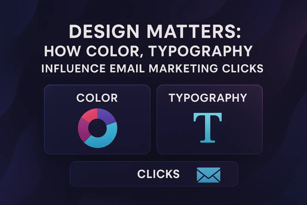
Design Matters: How Color, Typography and it influence clics in Email Marketing
An email’s look is key to grabbing the audience’s attention. In email marketing, design is more than looks. It’s a big player in getting people to click and in making campaigns succeed.
The Direct Correlation Between Design and Engagement
There’s a clear link between an email’s design and how much people engage with it. Typography influence in emails is very important. The right font makes reading easier and gets more people involved.
Colors also play a big role. They help highlight important parts like call-to-action buttons. This makes people more likely to click. Simple and clear designs are often best, making emails more engaging.
Measuring Design Impact on Click-Through Rates
Marketers use A/B testing to see how design affects click-through rates. They test things like colors, fonts, and layout. Analyzing the results shows what works best with the audience.
By looking at how different designs perform, marketers can make their emails better. This way, they make choices based on real data, not just guesses.

Color Psychology: The Silent Persuader
In email marketing, color psychology is key. It can make or break a campaign’s success. Colors greatly affect how people see and act on emails.
Colors can make people feel different ways. For example, red means hurry up and act now. Blue means trust and safety. Knowing this helps make emails that people like.
Emotional Responses to Different Colors
Colors can make people feel calm or excited. Green makes people feel calm and happy. Orange makes people feel excited and ready for deals.
As
“Color is a power which directly influences the soul.” – Wassily Kandinsky
colors deeply affect our feelings. Choosing colors wisely is very important in email marketing.
Cultural Considerations in Color Selection
Cultures see colors differently. White means pure in the West but sad in Asia. Marketers must think about these differences to avoid mistakes.
Industry-Specific Color Associations
Colors mean different things in different fields. Banks use blue for trust. Health brands use green for natural things. Knowing these helps pick the right colors for your brand.
Strategic Color Implementation for Email Campaigns
Colors in email marketing can really boost click-through rates. They can make people feel certain ways and point out important parts of the email.
It’s important to know how colors affect us and use them wisely. Pick colors that match your brand and make the email easy to use.
Call-to-Action Button Colors That Convert
The color of your call-to-action (CTA) buttons matters a lot. Contrasting colors that pop against the background work best. For example, a dark CTA button on a light background grabs more eyes.
Research shows orange and green are top choices. They’re easy to see and make people feel urgent or happy.
| CTA Button Color | Average Conversion Rate |
|---|---|
| Orange | 4.23% |
| Green | 4.01% |
| Red | 3.56% |
Background and Text Color Combinations
Choosing the right background and text colors is key for easy reading. A strong contrast is best. Dark text on a light background or the other way around works well.
For example, black text on a white background is easy to read everywhere. Think about the color temperature too. Cool colors like blue calm us, while warm colors like yellow energize us.
Typography Fundamentals for Email Marketers
Typography is key in email design. It can make a campaign succeed or fail. The right fonts make emails easy to read and look good. The wrong ones can cause people to leave quickly.
Choosing the right fonts for emails is very important. Different fonts show different personalities. This can change how people see your message.
Font Categories and Their Personalities
Fonts are grouped into serif, sans-serif, script, and decorative types. Serif fonts, like Times New Roman, feel traditional and professional. Sans-serif fonts, such as Arial and Helvetica, look modern and clean. Script fonts add elegance, and decorative fonts grab attention.
Readability Factors in Digital Communications
Readability is key for email success. Things like font size, line spacing, and text vs. background contrast matter. For body text, use a font size of at least 14px. Line spacing should be 1.5 times the font size.
Knowing typography basics helps email marketers. It can boost engagement and sales.
Font Selection Strategies for Higher Engagement
The right font can make your email marketing better. It makes your emails easy to read and look good. Choosing the right font is key to how people see your content.
Serif vs. Sans-Serif in Email Environments
In emails, serif and sans-serif fonts are often debated. Serif fonts feel old-school, like they’re from printed books. On the other hand, sans-serif fonts are modern and clean. They’re easy to read on screens.
Font Pairing Techniques for Visual Hierarchy
Pairing fonts is important for email design. It helps guide the reader’s eye. You can use a bold sans-serif font for titles and a serif font for the rest.
Web-Safe Fonts vs. Custom Typography
Choosing between web-safe fonts and custom typography depends on your goals. Web-safe fonts work on all devices. But custom typography can make your brand stand out. It might need fallback fonts for some devices.
Knowing about font selection can make your emails better. It could lead to more people engaging with your content.
Text Formatting That Drives Clicks
Text formatting is key in email marketing. It grabs the reader’s attention and boosts clicks. How you show your text matters a lot.
Good text formatting includes several important parts. These parts make your text easy to read and fun to look at. One big thing is the right line length and spacing.
Optimal Line Length and Spacing
Keeping line length just right is important. Lines that are too long or too short can mess up reading. Aim for 50-75 characters per line.
Also, don’t forget about line spacing. A good rule is to use 1.5 times the font size for spacing.
| Line Length (Characters) | Readability Impact |
|---|---|
| Less than 50 | Difficult to follow |
| 50-75 | Optimal readability |
| More than 75 | Overwhelming |
Strategic Use of Bold, Italic, and Underline
Using bold, italic, and underline text can highlight important points. Bold text is great for headings and calls to action. Italic text adds emphasis or shows quotes. Use underline text carefully, as it might look like a link.
As an email marketing expert once said,
“The smart use of text formatting makes your emails more engaging and easy to read.”
Font Size Considerations for Mobile and Desktop
Choosing the right font size is key for reading on different devices. For desktops, use 14-16 pixels. For mobiles, go for 16-18 pixels because screens are smaller.
By focusing on these text formatting tips, you can make your emails look good and work well. They’ll help get more clicks and conversions.
Visual Hierarchy: Guiding the Reader’s Eye
In email marketing, visual hierarchy is key. It makes sure important info stands out. This helps readers easily find what they need and connect with the message.
Marketers use color, typography, and images to guide the reader’s eye. This makes the email more effective.
Structuring Information for Scanability
To make info easy to scan, organize it well. Use headings, subheadings, and bullet points to break up text.
Key strategies include:
- Use clear headings to sum up main points.
- Use subheadings for extra context.
- Make lists with bullet points for easy reading.
Using Design Elements to Emphasize Key Messages
Design elements like color, typography, and images highlight important messages. They grab attention and encourage action.
For example, bold fonts or contrasting colors on CTAs boost clicks. Also, using white space reduces clutter and makes content easier to read.
The Interplay Between Color and Typography
Color and typography work together to make emails look good. When done right, they make emails easy to read and more impactful.
Creating Contrast for Readability is key. Choose colors that stand out against the background and text. For example, dark backgrounds with light text or light backgrounds with dark text help a lot.
Creating Contrast for Readability
Good color choices are important in email marketing. They help highlight important parts like call-to-action buttons. A bright CTA button on a calm background grabs attention well.
Choosing the right colors affects how people feel. Make sure text and background contrast is good for everyone, including those with vision problems.
Harmonizing Color and Font Choices
Matching colors and fonts is also vital. When choosing fonts for emails, think about how they look with the colors. Some fonts are easier to read with certain colors.
Find fonts that match the colors you picked. A simple font goes well with bright colors. A fancy font fits better with soft colors.
Good email design balances color and typography. This makes emails look nice and keeps readers interested.
Accessibility Considerations in Email Design
Accessibility in email design is key for reaching more people. It’s not just right, it’s smart. As more people use digital tools, making emails easy for everyone is vital.
Good email design means thinking about colors and fonts. This makes emails better for everyone. It also makes your brand seem more welcoming.
Color Contrast Requirements for Inclusive Design
Color contrast is very important in email design. The WCAG says text should be easy to see. This means a clear contrast between colors.
| Color Combination | Contrast Ratio | Accessibility Rating |
|---|---|---|
| Black text on white background | 21:1 | Excellent |
| Dark grey text on light grey background | 4.5:1 | Good |
| Light grey text on white background | 2.1:1 | Poor |
Typography Choices for Readers with Visual Impairments
Choosing the right font is also important. Use clear fonts like Arial or Helvetica. Make sure fonts can be changed and lines are not too close together.
Think about colors and fonts to make emails better. This helps more people see and enjoy your emails. It also helps your brand grow.
Email Design Trends That Boost Engagement
Email marketing keeps changing. It’s key to know the latest design trends to get more people to click. These trends make emails more fun and interactive for the person reading them.
Minimalism and White Space Utilization
Minimalism is big in email design now. It’s all about being simple and clear. Using white space makes emails easier to read and focus on what’s important.
A clean design looks better and works better too. It helps send messages clearly and quickly.
Interactive Elements and Microinteractions
Interactive stuff and microinteractions are getting popular in emails. They make emails more fun and memorable. Simple things like hover effects or quizzes can really get people involved.
Dark Mode Optimization Strategies
Dark mode is everywhere now. Emails need to look good in dark mode too. Designing for dark mode means picking the right colors and contrasts. This way, emails stay easy to read and look good.
| Design Trend | Best Practice | Benefit |
|---|---|---|
| Minimalism | Use ample white space | Improved readability |
| Interactive Elements | Incorporate microinteractions | Enhanced user engagement |
| Dark Mode Optimization | Adjust color schemes for dark mode | Better readability in dark mode |
Using these design trends can make emails better. They become more fun, interactive, and easy to use. This leads to more clicks and helps email marketing succeed.
Mobile-First Design Considerations
Most emails are opened on smartphones. So, making emails work well on small screens is key. This makes your emails look good and work right on phones.
Responsive Typography for Various Screen Sizes
Responsive typography is very important. It makes sure text looks good on all screens. Fluid typography uses special units to make text fit right.
Text that’s too small on phones is hard to read. But text that’s too big on computers messes up the page.
Touch-Friendly Color Blocks and Buttons
Colors matter a lot in mobile design. Color blocks and buttons need to be easy to touch. Use contrasting colors for buttons so they pop.
Also, buttons should be big enough to tap without mistake. Aim for a size of 44×44 pixels to avoid errors.
By paying attention to these details, you can make emails better on phones. This leads to more people engaging with your emails and better results for your campaigns.
A/B Testing Design Elements for Optimization
To make email marketing better, it’s key to test design elements. A/B testing lets marketers see which email version works best. This helps improve things like color, font, and layout to get more clicks.
Setting Up Effective Design Tests
Starting a good A/B test needs planning. First, pick what you want to test, like a button color or text font. Make sure to test one thing at a time. Also, decide how many people to test and for how long to get reliable results.
Interpreting Results and Implementing Changes
After the test, look at the results to see which version won. Don’t just look at numbers. Think about why one version did better. For example, if red buttons work better than green, think about what red means to your brand and audience.
Use the winning design in future emails. Keep testing to make your emails even better.
Tools for Design Testing and Analysis
Many tools help with A/B testing and analyzing emails. Here are some popular ones:
| Tool | Description | Key Features |
|---|---|---|
| Mailchimp | Email marketing platform with built-in A/B testing | Easy test setup, detailed analytics |
| HubSpot | Comprehensive marketing platform with A/B testing capabilities | Advanced segmentation, personalized content |
| Optimizely | Specialized A/B testing and personalization tool | Robust testing features, real-time results |
Using these tools and testing wisely helps email marketers improve their designs. This leads to better email campaigns.
Case Studies: Successful Email Design Transformations
Good email design can really help with getting people to engage and buy more. We can learn a lot from recent examples. These show us what works for different kinds of businesses.
Retail Brand Color Overhaul
A big retail brand changed their email colors to better match their brand. This led to a 25% increase in click-through rates. The new colors made their emails look better and helped people remember their brand.
Using color psychology in marketing helped a lot. The right colors made their emails more engaging and persuasive.
B2B Typography Refinement Success Story
A B2B company in software for big businesses changed their email fonts. They used a clean font and made text easier to read. This led to a 15% increase in engagement from their subscribers.
They followed typography influence in emails to make their emails look good and easy to read. This made their brand look more professional and their emails more effective.
Non-Profit Organization’s Design-Driven Campaign
A non-profit for a social cause made a special email campaign. They used great visuals and clear calls-to-action. This helped them double their donation rates compared to before.
This shows how important color psychology in marketing and good typography are. The non-profit’s emails effectively shared their message. This not only helped their fundraising but also made their brand stronger in the community.
Conclusion: Implementing Strategic Design for Email Success
Good email marketing needs smart design to grab attention and get people to click. Knowing about colors, fonts, and how things are arranged helps a lot. It makes emails better and gets more people to open them.
Design for emails is always changing. Now, it’s all about being simple, interactive, and working well on phones. Trying out different designs helps businesses get better at sending emails. They need to make emails look good and be easy to use.
Designing emails well is key to getting more people to click on them. By using what we talked about, marketers can make emails that are not just pretty but also work well. This way, emails can really connect with the people who read them.
FAQ
How does color psychology impact email marketing campaigns?
Color psychology is key in email marketing. Different colors can make people feel different ways. For example, red can make you feel urgent, while blue can make you feel safe.
What typography is best suited for email marketing?
Sans-serif fonts like Arial or Helvetica are best for emails. They are easy to read on many devices. But, your choice should match your brand and message.
How can I optimize my email design for better click-through rates?
To get more clicks, use a clear subject line and a nice layout. Make sure your call-to-action buttons stand out. Also, make sure your email looks good on phones. Try different things to see what works best.
What is the importance of contrast in email design?
Contrast is very important in email design. It makes text easy to read and highlights important parts like buttons. Good contrast helps everyone see your email well, even those with vision problems.
Can using too many fonts in an email be detrimental?
Yes, too many fonts can mess up your email. It makes it hard to read and look bad. Stick to one or two fonts that fit your brand for a clean look.
How does dark mode affect email design?
Dark mode changes how emails look. Designers need to think about dark mode when choosing colors. This ensures your email looks good and is easy to read.
What are some current email design trends that can boost engagement?
Trends like minimalism and using white space can make emails better. Adding interactive elements and microinteractions also helps. These make emails more fun and engaging.
How can I ensure my email design is accessible?
To make emails accessible, think about color contrast and font size. Use simple language and add alt text for images. Testing with screen readers also helps.
What role does A/B testing play in optimizing email design?
A/B testing is very important for improving email design. It lets you see which designs work best. This helps you make your emails better and get more engagement.